

Good prints start long before you press Export. A photo that looks gorgeous on a phone can fall apart on paper if the resolution is low, the color space is wrong, or the file is over-compressed.
The fix is a small workflow you can repeat every time: size the image correctly, convert colors for the press, export a clean file, and proof with fresh eyes.
Do that, and your posters, postcards, zines, and album art will arrive sharp and accurate, with colors that match what you approved and type that stays readable at normal viewing distance. Here is a simple checklist that works.
Start With Resolution, Size, and DPI
Work backward from the final piece. If the poster is 12 by 18 inches at 300 DPI, multiply inches by DPI for 3600 by 5400 pixels. Upscaling more than about 20 percent invites softness, so start with the largest original you have. Crop deliberately, run noise reduction before any sharpening, and keep detail masks tidy.
Match DPI to the print method. 300 DPI covers most photo and marketing work, while fine art or tiny type can benefit from 400 to 600 DPI. Set document units in inches or millimeters and name files with size and DPI. Save a layered working file and a separate export so edits stay reversible.
Color That Prints Right, Not Just Looks Right
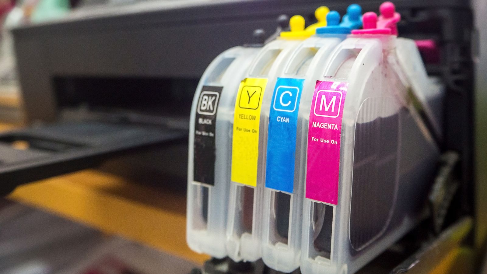
Screens use RGB, presses use CMYK. Convert late in the process, not at the last second, so you can fix clipped shadows or neon hues that will dull on paper.
Pick the ICC profile your printer recommends, such as GRACoL or FOGRA, and soft proof against it. Desaturate aggressive blues and greens so they survive conversion.
Calibrate your display monthly and avoid judging color at full brightness. Use a neutral background and view at 100 percent. If skin tones turn muddy after conversion, lift midtones and add selective warmth. Keep CMYK as the final working state for that piece, since re-exporting from RGB can shift color twice.
File Formats, Compression, and Clean Exports
Choose the format that fits. TIFF with LZW or ZIP keeps quality and supports CMYK. For images dropped into layout apps, a quality 10 to 12 JPEG is fine if the source is large.
Keep compression gentle and avoid double-compressing after edits. Name layers and flatten only when you are sure.
If you are turning a photo into a tactile object, like a relief badge or a lithophane, an image to STL guide helps you move from pixels to a printable model without trial and error. Keep 2D prep tight, then convert once contrast and edges are right.
Even for 3D prints, size and clean edges matter because they determine how the relief reads under light.
Bleed, Margins, and Safe Area Save Reprints
Printers trim stacks, not single sheets, so design with bleed. Add at least 3 millimeters or one eighth of an inch on all sides and extend backgrounds across it.
Keep text and logos inside a safe area of 3 to 6 millimeters inside the trim. If a photo touches an edge, extend the crop; never stretch.
Preview the layout in context. Simple mockups show how the piece sits on a desk, in a hand, or on a wall. They make problems jump out, like a phone number too small or margins that feel tight.
Export a proof at actual size and tape it to the surface it will live on to check legibility.
Proofing That Catches Errors Before They Cost You
Do a preflight pass. Confirm resolution, color mode, embedded profiles, overprint settings, and outlined fonts.
Zoom to 200 percent and scan edges for halos from heavy sharpening. Print one page on a desktop device to confirm scale, then export the press file. If you are printing a PDF on a Mac, Preview is a fast checker.
Ask the printer for a hard proof or a calibrated digital proof when color is critical. Confirm paper stock, weight, and finish in writing – track changes in a single email thread and version filenames with dates. Small habits prevent expensive reprints. Archive the approved proof and source links so the job is reproducible.
Vendors, Specs, and Final Checks
Good vendors make this easier. Compare online printing services that publish clear spec sheets and preflight tips, then download their templates to avoid avoidable errors.
Match paper, finish, and turnaround to the job, for example matte for text-heavy flyers and gloss for photo-forward postcards. Ask for ink limits and minimum line weights.
Run one last check on the exported file. Open it on a second machine, verify page count, run a text search for obvious typos, then package everything into a single folder for handoff.
Keep a simple checklist and train yourself to run it every time. Boring predictability beats drama when files leave your screen.


